Title: Causal Inference Is Not Just a Statistics Problem
Authors & Year: McGowan, L.D., Gerke, T., and Barrett, M. (2024)
Journal: Journal of Statistics and Data Science Education [DOI: 10.1080/26939169.2023. 2276446]
Review Prepared by David Han
Causality Is Not Obvious, Even with Good Data
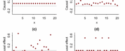
In Statistics 101, we learn that correlation does not imply causation. Truly understanding this is one of the trickiest challenges across all disciplines. Let’s start with a question: Does drinking coffee cause better exam performance? You might run a survey and find that students who drink more coffee tend to score higher. Great! Does this mean coffee helps you score better? Not so fast. What if more studious students are both more likely to drink coffee and more likely to study hard? In that case, it is not the coffee. It is their study habits. Or what if students drink coffee because they are stressed from cramming, and that actually hurts performance? This is the world of causal inference – figuring out whether one thing actually causes another. It is not the same as finding patterns or correlations in the data. But wait… don’t we already have statistics for this? We do, and they are useful. But here is the catch: statistics alone can trick you. McGowan et al. (2024) built four example datasets to explain this; just like the famous Anscombe’s quartet, where different graphs have the same summary stats. In their version, the numbers look the same even though the real causal stories are totally different. They called this the “causal quartet.”
Four Data Stories that Look the Same, But Are Not
Imagine you have three variables:
X = the thing you think causes something (e.g., how many hours someone works out)
Y = the outcome (e.g., blood pressure)
Z = a third factor (e.g., diet)
Let’s walk through their four examples, simplified and with real-life analogies; see Figure 1 for their graphical illustrations.
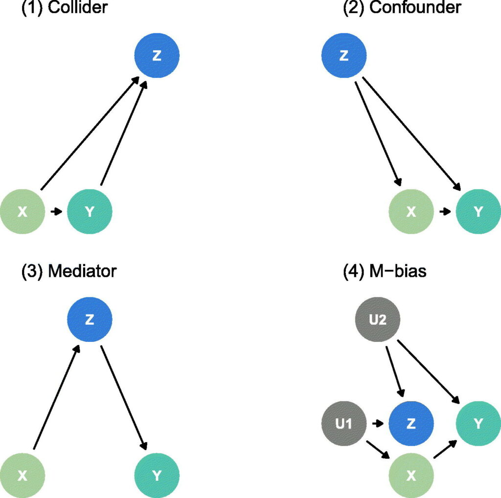
1. The Collider Trap
Example: X = exercise, Y = blood pressure, Z = heart doctor visits.
Imagine that both exercise and blood pressure affect how often someone visits a doctor. Now, if we adjust[1] for Z (doctor visits), we might accidentally create a fake connection between exercise and blood pressure that did not exist before. That is, adjusting for a variable that is affected by both X and Y can backfire.
2. The Confounder Problem
Example: X = coffee drinking, Y = test scores, Z = sleep quality.
If sleep affects both how much coffee you drink and how well you perform on tests, and you ignore it, you may think coffee helps, when it is actually just a stand-in for good sleep. Thus, sometimes, you must adjust for certain variables to avoid misleading results.
3. The Mediator Mistake
Example: X = hours studied, Z = confidence, Y = test score.
Studying may boost confidence, which in turn improves scores. If you adjust for confidence (Z), you only see the direct effect of studying, not the full (total) benefit. Without adjustment, you get the whole picture. So, adjusting for a “middle step” cuts out part of the causal path.
4. The M-Bias Mystery
Example: X = job training, Y = promotion, Z = personal connections.
Suppose job training is influenced by ambition (U1), and promotions are influenced by popularity (U2). If both ambition and popularity affect how many “connections” someone builds (Z), then adjusting for Z may actually introduce new bias, even if Z seems important (in this case it could create a spurious association between job training and promotion). Sometimes adjusting can create problems, especially when hidden factors are involved.
Here is the kicker. In all four of these examples, the correlation between X and Y is the same. Even the graphs look similar. But the correct way to estimate the effect of X on Y depends entirely on understanding how the variables are connected.
So What Can We Do? Do Not Just Analyze – Think!
The authors argue that causal inference requires more than number crunching. Here is what they suggest instead.
1. Draw Causal Diagrams (viz., DAG)
These are simple flow charts that show what causes what. They are based on real-world understanding, not data alone. For instance, exercise → weight loss → lower blood pressure. It helps you decide which variables you should adjust for and which you should not.
2. Talk to Experts
If you are analyzing medical data, talk to medical professionals. If you are studying economics, talk to economists. They will know whether Z comes before or after X, and what makes sense causally, not just statistically.
3. Think About Time
Causal relationships happen in order: the cause must come before the effect. That is obvious but in data analysis, it often gets ignored. If you measure stress levels after someone starts exercising, do not use stress to decide what caused what. This time-ordering rule helps avoid both collider and mediator traps.
4. Use Pre-Exposure Information Only (when in doubt)
If you are deciding which variables to adjust for, use only those that existed before the exposure. That reduces the risk of accidental bias. It does not fix everything (see M-bias) but it helps.
Final Takeaway – Think Like a Scientist
Causal inference is about asking good questions, not just running fancy models. You can have perfect data, beautiful graphs, flawless code, etc. and still get the wrong answer if you do not understand the story behind the data. Whether you are trying to figure out what impacts health, learning, behavior, or business outcomes, always ask: Do I understand how these things are connected or am I just looking at patterns? If you can answer that honestly, you are on your way to becoming not just a good analyst but a good scientist.
1. Adjust (statistical term): To control for a variable by conditioning on it in the analysis (e.g., including it in a regression model) with the intent of removing confounding. However, adjustment can sometimes introduce bias such as in the collider trap.