Title: Permutation Entropy for Graph Signals
Authors & Year: Fabila-Carrasco, J.S., Tan, C. and Escudero, J. (2022)
Journal: IEEE Transactions on Signal and Information Processing over Networks [DOI: 10.1109/TSIPN.2022.3167333]
Review Prepared by Moinak Bhaduri. Associate Professor, Mathematical Sciences, Bentley University
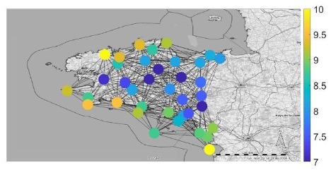
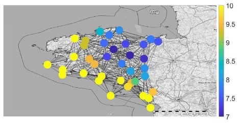
Imagine being a weather scientist, tasked with monitoring temperature fluctuations at recording stations at odd locations strewn across the country, raising alarms when something looks off. You may yawn at the blandness. Temperature, you would say, is something whose fluctuations are, by default, predictable (after all, they are not like stock prices): it generally gets warmer as the sun rises, and cooler as the sun sets. What else is there to observe? It is a nice, almost boring system that never alters. And the fact that this is true regardless of where you are – by the sea or atop a mountain – adds to the blandness. But before you resign and say there is no interesting question to raise here, look at figures 1A and B and tell me what strikes you.
These are temperature values measured at different locations in Brittany, northwest France at two different times of two days: the first (figure 1A) the temperature profile around midday, the next (figure 1B), around dawn. The extremes of temperatures are easier to monitor – the yellows and the purples (for instance, warmer temperatures are along the southern shoreline at dawn). It may be reasonable to expect that as the day wears on, the distribution of the maximum temperature to be the same (i.e., the yellows should occupy similar spots) — that is, every location in the country ought to warm up at similar rates leaving the winning and losing spots unaltered. If the distribution gets messed up from the neat yellow-purple separation at dawn, it could point to interesting underlying geography, a cloud cover that hovered over specific regions of the country, or plenty of other reasons. What Fabila-Carrasco, Tan and Escudero, in their article “Permutation entropy for graph signals”, have primarily done is develop a system through which we can tell how similar values on neighboring nodes in the web are — that is, how ordered the color profile is. The smaller their metric, the more ordered. For instance,, at dawn the value of their metric was $0.3313$, and at midday, $0.7529$, reflecting the observations above.
Add to all this the realization that the network architecture may hit closer to home depending on your taste. Spatial networks may not be guided necessarily by geographies mentioned above. Electrical impulses or the amounts of blood flow at different regions inside your brain could be of interest in medicine, where the query could be how or whether the distributions of extremes of these vital markers alter substantially post-trauma. There is a different MathStat article (April 18, 2025) that discusses how a specific kind of network sheds vital light on ovarian cancer. Different locations in the galaxy or the cosmos could offer up yet another network where the amount of gamma radiation at these locations could be of interest to astrophysicists who may query distributions of these maximums post a solar storm. Or the network may be metaphorical, instead of spatial, such as a social networks where edges are formed (joining nodes) not through similarities of locations but through shared (perhaps reciprocated) communications and interests. One could query whether extremes of some version of social capital or attitudes persist amongst friends.
Thus, whenever, you use networks, asking whether some quantity of interest is distributed similarly in certain neighborhoods becomes vital and motivating questions like our temperature monitoring do not seem quite so bland after all(It is worth noting here that while we are using networks and graphs interchangeably that some scholars, (Crane 2018), do point out subtle differences between networks and graphs: that “networks” are like novels and “graphs” are like grammars). Despite the basic ingredient being pretty predictable (the temperature, for instance, that goes up and down with the rising and the setting of the sun), the distribution or the scattering of secondary objects of interest (the extremes of these temperatures) may prove to be unpredictable.
Chaos in non-networked systems
If one examines a simple time series (as opposed to several interacting time series, interacting through a network), there are ways to quantify its predictability. Permutation entropy, defined as
is an option where pis represent the chance of observing a specific arrangement (the $i-th$ one) of values. This is elaborated below. The authors have upgraded this way of measuring predictability to situations where values are not one after another, rather on adjoining nodes in a network, but first we need to unpack equation 1. Take a motivating time series
which is moderately predictable: there is a general tendency to go up: $(3,6,8,9)$, which sometimes get disturbed: $(5,10,2)$. So, if one were to ask how chaotic or unpredictable the sequence is, we’d say “somewhat”, torn midway between the systematic $(3,6,8,9)$ and turbulent $(5,10,2)$ parts of the series. The permutation entropy for this time series calculated using expression (1) shows how the “somewhat” corresponds to a neat (normalized) number: $0.5887$. This meets our expectation as it straddles midway between $0$, reflecting no chaos or perfectly ordered systems, and $1$, reflecting maximal chaos or perfectly disordered systems.
In order to do the permutation entropy calculation, the general strategy involves breaking up the time series in chunks of equal sizes, recording the ranks of the collected values, and noting how common the rank pattern is. The more common a specific rank pattern, the more ordered the flow is (that is, low chaos); if all rank patterns are equally common, the more disordered (that is, high chaos). The $D$ in equation (1) is the embedding dimension which shows how large each chunk should be. For instance, with $D = 3$ our chunked up time series would record combinations of three neighboring values and would look like the left section on figure 2. From this list, we create a record of observed rank patterns (right section, figure 2) which shows how, within each local window, the values relate to each other: low, medium, high.
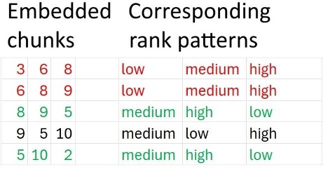
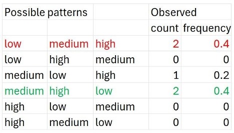
Permutation, you may recall, stands for arrangements and rearrangements, and the reason why equation 1 is called permutation entropy is that on the next step, we make provisions for all arrangements of rank patterns that could have been possible and tally these with our observed figure 2 to check how many of them actually materialized. This is shown in figure 3. For instance, we saw the “low-medium-high” pattern twice (in red), but never saw the “high-medium-low” one (but could have, in general). The pis represent the relative frequency of the $i-th$ pattern – a proxy for how common or prevalent that pattern is in our observed set. The idea is that if some pattern – no matter which (for instance, low-medium-high repeated would suggest a strong monotonic trend, low-high-medium would suggest periodicity, etc.) – is very common, that is some $p_i \rightarrow1$, $PE_D\rightarrow0$, since $log_2$ $p_i\rightarrow 0$, bringing out the fact that the sequence is non-chaotic. In other words, as the proportion of any specific pattern nears $1$, owing to it being very common, since $log 1$ to any base is $0$, from equation (1), we’d know the total permutation entropy would near $0$.
In our case (Shannon’s convention: $0$ $log_2$ $0=0$),
which, when relativized by $log_2 3$, the benchmark, gives $0.5887$, seen above (the normalization is needed to ensure fair comparison across different dimensions. For instance, in the next section, when the embedding dimension is $2$, we normalize by $log_2$. The normalization enables us to gauge the entropy on a per-dimension basis). For a monotonically decreasing sequence, for instance, no matter which three-piece chunk you look at (in fact, a chunk of any size) the rank pattern is always high-medium-low making $p_6=1$, and the others $p_1=\ldots =p_5=0$, resulting in $PE_D=0$, reflecting the perfect order. Simulate some pure noise on your computer with no connection (or autocorrelation) between neighbors, and see how $PE_D\rightarrow 1$, since each rank pattern will be equally prevalent, that is each $p_i$ will have an equal share.
Time-space transitions
Now we can see how the authors upgraded permutation entropies to deal with networked time series. In order to do this though, we will need to be mindful of two distinct structures the authors are studying in parallel. First, a network that points out which nodes are connected to which (representing, say, the weather stations) , and the second, a time series that gets generated at/by each node (representing, say, the temperature values recorded at that station over the course of a day). The previous section described a way to talk about the complexity, were we dealing with only the second structure, that is, if we had one time series emerging from one node. To extend similar ideas to networked settings, the authors froze time momentarily, and compared the value a node generated at that time to the average value its neighbors generated at that same point in time. If these two numbers are almost always ordered the same way,, in other words most node values are larger than the second no matter which node we pick (as opposed to which time point we pick, much like the persistent low-medium-high pattern from the last section), the entropy will be low. If instead, sometimes node A generates a value larger than the average value of its neighbors, and sometimes it generates a smaller value, then the distribution of values will be confirmed to be chaotic.
Concretely, at a fixed moment in time – such as dawn on figure 1B – take the value generated by the $i-th$ node to generate a value (like the first $3$ in our time series (2), instead of a full a vector of values) $x_i$. If N(i) represents the set of other nodes connected to this $i-th$ one, and $deg(i)$ represents the degree of this node (that is, how many other nodes “I” is immediately connected with), $\frac{1}{deg(i)} \sum_{j \in N(i)} x_j$ will show the average contribution of values – say, average temperature – from “$i$”’s immediate neighbors. The authors next suggest we compare
and record how many times – as we vary node “$i$” – the first number exceeds the second. You could say the embedding dimension $D$ here is $2$ – we are comparing two numbers – much like it was $3$ in the previous section when we compared three numbers. This dimension’s role, therefore, earlier, was to chunk up time gluing and comparing historical neighbors, now it is to chunk up space, analyzing geographical neighbors.
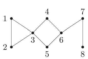
Figure 4: A hypothetical network of connections showing which locations or individuals are connected to which others
For instance, for the eight-node network shown in figure 4, with the values recorded at these nodes being, at a given point in time
these eight comparisons are $(-1,-1.15)$, $(-2.3,-0.5)$, $(0,-1.325)$, $(-3,2.5)$, $(1,2.5)$, $(5,-0.333)$, $(1,1.95)$, $(-1.1,1)$. That is, the $(-1, -1.15)$ shows while the value generated from the first node is $-1$, the average value generated from its neighbors – nodes 2 and 3 at that point – is $(-2.3+0)/2 = -1.15$. The red pairs are where $x_i > \frac{1}{deg(i)} \sum_{j \in N(i)} x_j$, the values from the nodes being larger than the average from the neighbors (that is where we have a high-low pattern) and the green pairs are where $x_i < \frac{1}{deg(i)} \sum_{j \in N(i)} x_j$. So, of the two patterns – or permutations – possible now, in the spatial case with $D=2$, low-high and high-low, neither overwhelmingly dominates (a $5$-$3$ split) which makes
which, when normalized (by $log_2$) gives $0.95$, suggesting a chaotic pattern, the value being closer to $1$. This is much like the temperature spread we saw around midday on figure 1a ($0.7529$ for that example). If a neat spatial gradient exists making the temperature distribution non-chaotic, where one kind of temperature (warm or cool) gradually and systematically gives way to another – such as on Figure 1b around dawn – one color, either the red or the green (i.e., either the high-low or the low-high) will dominate, making the entropy small, pointing to the underlying predictability.
Having this foundation in place, allowed the authors to do even more. While the above analysis assumed a set structure and looked at how different values from the nodes impact chaos, going the other direction is made possible through this brand of entropy too. For instance, they have shown through simulations that these entropies can detect different degrees of regularity on similar graph structures. That is, if similar values were coming out of a set of nodes, the entropy metric will be smaller for an architecture that is more regular, or connected, and larger for one that is less connected. The motivating examples we looked at earlier may benefit immensely. In the case of brain synapses break post-trauma, or channels joining different regions of the solar system becoming disrupted post a significant astronomical event, these entropies can sound alarms. While these may be wishful thinking on the part of yours faithfully, the authors have, in fact, carried out a similar analysis to differentiate between younger and older heartbeats.
Ever since Claude Shannon’s initial formulation of the idea Shannon (1948), tweaks to entropy’s definition have been profuse. Still, despite sticking to the same format of definitions, innovations around the building blocks – such as the way we can interpret the embedding dimension, as these authors have pointed out – never cease to amaze.
References
Fabila-Carrasco, J.S., Tan, C. and Escudero, J., “Permutation Entropy for Graph Signals,” in IEEE Transactions on Signal and Information Processing over Networks, vol. 8, pp. 288-300, 2022, doi: 10.1109/TSIPN.2022.3167333.
Crane, H. Probabilistic Foundations of Statistical Network Analysis. London: CRC Press, 2018.
C. E. Shannon, “A mathematical theory of communication,” in The Bell System Technical Journal, vol. 27, no. 3, pp. 379-423, July 1948, doi: 10.1002/j.1538-7305.1948.tb01338.x.