Article: Directional Outlyingness for Multivariate Functional Data
Authors and Year: Wenlin Dai & Marc G. Genton 2019
Journal: Computational Statistics & Data Analysis
Review Prepared by: Moinak Bhaduri
Department of Mathematical Science, Bentley University, Massachusetts
Outliers are individuals and entities to whom we have forever turned with awe and skepticism, with curiosity and suspicion, with expectation and anxiety. They do not fit the norm and are, oftentimes, for better or for worse, risky to ignore. Malcolm Gladwell in his book Outliers: The story of Success samples our society and brings out such remarkable individuals and examines commonalities: what thread binds them, what makes them deviate from the crowd. And just as a common tendency is difficult to pinpoint while investigating these people – some were forced to the extremes by social pressure or hardships, while some others are propelled by sheer curiosity – statistical data which are more complex than simple numbers, may stray from the mainstream in many ways. And tools to catch this weirdness need to evolve. Such is the central message Dai and Genton in their work “Directional Outlyingness for Multivariate Functional Data” try to voice.
How depth could separate the wheat from the chaff
To get our bearings right, let’s initially look at simple statistical “objects”: plain numbers. Imagine a set of numbers: $\Set{2,3,8,8.5,8.75,9,9.1,9.15,9.17,9.21,17.23,18.67}$. These could represent anything, anything at all. In our case let’s say they are the amount, in inches, of snow at a certain place over twelve consecutive days. Sidestepping technicalities (that is, what precise definition you have in mind), the last and the first two observations seem to be “outliers”: they do not match or “fit in” with the other values, so to speak. Spotting them is crucial for several standard statistical tasks. Were the first two not there and were we to find the average amount of snow, for instance, the usual mean would get inflated, giving off the wrong impression of precipitation amount. The sample mean, thus, gets pulled towards extreme observations, and, as we know, the median or the trimmed mean (recall: trimmed means are actually usual means calculated after removing, say, the top and bottom $5%$ of the observations) are more apt in these settings. To be sure, however, that the median is really called for, or how much to trim, we must be sure though there are these outliers. This is how – at least for this simple average-finding task – the detection problem gets critical.
You may have seen standard detection techniques. The $68$-$95$-$99.7%$ rule for instance. That is, if an observation is more extreme than $99.7%$ of all, we may flag it as an outlier. The trouble is many of these prescriptions are tied to assumptions. Assumptions that could prove unrealistic. The above one, for instance, works under the assumption that a bell-shaped, normal-like distribution gives rise to these numbers. Since in that case, within three standard deviations on either side of the average we are likely to find nearly everyone, $99.7%$ specifically. If we insist on keeping the three standard deviation limits, the chance (i.e., how often we find observations that extreme) may vary (exact numbers are hard to find; inequalities such as the Tchebyshev’s offer bounds), if we insist on the same chance, the limits may vary.
Statisticians, consequently, have thought of alternatives. One such is “depth”. Basically, to calculate the depth of a given number in a list, we calculate the proportion of observations that are less than (or equal to) it, and the proportion of observations that are more than (or equal to) it, and then take the minimum of these two proportions. There are many equivalent formulations of the idea; this one, probably, is the quickest to grasp. To the technically-minded among you, the depth $d(x,F)$ of an observation $x$.
$$d(x, F)=\min\{F_X(x), 1-F_X(x)\}~~~(1) $$
where $F_X(x)$ is the (empirical) cumulative distribution function, added to stress that the underlying distribution need not be normal all the time. How to interpret the depth, you ask? If either of these proportions turn out to be worryingly small, that is, if the depth turns out to be little, the observation under inquiry can be interpreted to be sitting along the “edge”, on the “surface”, of your data ocean. That is, it is different from the mainstream observations that are lodged solidly in the sea and is, therefore, potentially an outlier.
Table 1: Depth and outlying-ness calculation for the “inches of snow” data introduced earlier
| $X$ | $F_X(x)$ | $1-F_X(x)$ | $D(x,F)$ | $O(x,F), Od(x,F)$ |
| $2$ | $0.08333333$ | $0.91666667$ | $0.08333333$ | $11.0, -11.0$ |
| $3$ | $0.16666667$ | $0.83333333$ | $0.16666667$ | $5.0, -5.0$ |
| $8$ | $0.25000000$ | $0.75000000$ | $0.25000000$ | $3.0, -3.0$ |
| $8.5$ | $0.33333333$ | $0.66666667$ | $0.33333333$ | $2.0, -2.0$ |
| $8.75$ | $0.41666667$ | $0.58333333$ | $0.41666667$ | $1.4, -1.4$ |
| $9$ | $0.50000000$ | $0.50000000$ | $0.50000000$ | $1.0, 1.0$ |
| $9.1$ | $0.58333333$ | $0.41666667$ | $0.41666667$ | $1.4, 1.4$ |
| $9.15$ | $0.66666667$ | $0.33333333$ | $0.33333333$ | $2.0, 2.0$ |
| $9.17$ | $0.75000000$ | $0.25000000$ | $0.25000000$ | $3.0, 3.0$ |
| $9.21$ | $0.83333333$ | $0.16666667$ | $0.16666667$ | $5.0, 5.0$ |
| $17.23$ | $0.91666667$ | $0.08333333$ | $0.08333333$ | $11.0, 11.0$ |
| $18.67$ | $1.00000000$ | $0.00000000$ | $0.00000000$ | $\infty, \infty$ |
The intuition mainly stems from the fact that the cumulative distribution function is designed to “look” one way. Imagine being trapped in an infinite tunnel with two walls separated by 1 meter that are heated to the point of being risky to touch. So, you would rightly guess the safest place to be is dead-center on the floor (analogous to being the median in the list), whereas if you veer towards either wall – no matter which – you run the risk of getting burned. If you’re standing on location $X, F_X(x)$ in this formulation measures how much space you have between you and the left wall, which means $1 – F_x(x)$ measures how much space you have between you and the right. If either turns out to be small, that represents a sad situation (analogous to being an outlier) since that would mean we have navigated dangerously close to one wall – any one wall, doesn’t matter which – they’ll both burn us equally. This minimum, therefore, measures the distance between you and the closer of the two walls and could tell us the amount of risk we have landed us into. The smaller the minimum, that is the smaller the distance, the more the risk (of getting burnt, of being an outlier, that is).
Table 1 shows some pen-and-paper calculations for the depth of the twelve numbers introduced above – the “depths” of the snow settled (boo!! I know, thank you) – please see column four, confirming what we felt: the most “okay” observation is the one dead center – the median, which has the deepest depth, with these depth values shallowing out as we inch towards the fringes. Now how shallow is too shallow is a good question. Meaning, should we flag the two most shallow observations as outliers? The three most? The four most? Sadly, these will take us too far adrift and will be distracting to the main theme here. I will point you instead to Cuevas, Febrero, Fraiman (2006) if you’re interested in these questions around significance. Maybe I’ll write about those some other time. For now, rest assured, there is a solid system in place (using bootstrapping and resamples) that helps us work out the “right” number of shallow observations.
What Dai and Genton did instead may seem lackluster at first glance. They have introduced the “outlying-ness” score $o(x,F)$ of a value $x$ that is connected to its “depth” score $d(x,F)$ through
$$d(x, F)=\frac{1}{1+o(x, F)}~~~(2) $$
or
$$o(x, F)=\frac{1}{d(x, F)}-1~~~(3) $$
So, in our “wall” analogy, the closer we stand to any wall, that is, the smaller our “depth” or distance is, the larger will be the outlying-ness score of that location. The more “centrally” we stand, the smaller will be the outlying-ness score. Take the number $8.75$, for instance. It seems to be an “okay” observation. Its depth, therefore, must be big, to signify standing centrally. Its distance from the left wall is $0.416$ (see table one, a measurement of proportions), from the right wall is $0.583$, indicating a “depth” value of $0.416$, the smaller of the two. Its outlying score, therefore, must not be very big. And it is not. It is only 1$/0.416 – 1 = 1.4$ which is small compared to the other numbers, that is the other “locations” on the “floor”.
Aside from opening up a new orientation – “depth” and “outlying-ness” are opposite properties (a shallow depth will mean a huge outlying-ness score; see Table 1) – and modifying some technicalities – while depth is bounded between zero and one, outlying-ness can be any big number – nothing really seems to have improved. But keep in mind: we are looking at simple objects like numbers in this section. Let’s graduate!
Directional outlying-ness in functional data
Data scientists are obsessed with the decompositions. Wherever you look, a breakup is never too far away. In regression, the “total variation” breaks up into the “sum of squares due to regression” and “the sum of squares due to errors”. In the analysis of variance, the total variation breaks up into the “within sum of squares” and the “between sum of squares”. In time series, a value, almost by default, is taken to be a composition, that is, a sum of a trend piece, a seasonal variation piece, and a random noise piece. In probability theory, you represent a total norm as the sum of some norm that you can control and some other that hopefully goes to zero in the limit (in case you are dealing with convergence type ideas). In statistical inference, a variance is often broken down into the variance of the expectation and the expectation of variance. In machine learning, there’s the bias-variance tradeoff. The list goes on and on. Some variety of splitting stuff up seems always to be the order of the day. The context may change, but the itch never dies.
As our objects of study become more complex, outlying-ness may emerge due to various reasons. A number – like one of the twelve ones we have seen above – can be an outlier only because of a “wrong” value, but a point in a time series – a more complex object – may be an outlier either because of a “wrong” value, or a “wrong” time, or both. A decomposition, in these situations, helps. It could say an object is an outlier and provide the reason. Directional outlying-ness is a notion Dai and Genton introduced especially for objects like a total curve, instead of one number.
The idea springs forth from something that depth cannot do: all depth can point to are potential troublemakers, but it won’t tell us in what way they have gone “wrong”. Revisit table 1, column four. See how the “big” outliers and the “small” outliers receive the same depth score (and the same outlying-ness score too, for that matter) but note how the directional outlying-ness scores have a sign slapped on, which reveals this way of going wrong. The benefit is even more profound if one is not dealing with a number like 2, but instead a collection of numbers like a function (hence the name “functional data”). And if one chooses to examine the directional outlying-ness, instead of the depth of a functional object, there is a way it can be decomposed into smaller, understandable, manageable pieces, in a spirit similar to the others we have recalled above.
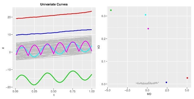
Figure 1: Functional directional outlying-ness decomposition in action. The red and deep blue curves deviate from the majority in magnitude (panel 1) which leads lead to above average MO values (panel 2); the pink and cyan curves do not deviate in magnitude, bit in shape (panel 1) which lead to large VO values (panel 2); the green curve deviates both in magnitude and in shape (panel 1) which leads to extreme values for both MO and VO (panel 2).
All that’s left now are the formalizations. The directional outlining the score $o_d(x,F)$ is defined as
$$o_d(x, F)=\Set{\frac{1}{d(x, F)}} v~~~(4) $$
where $v=\frac{x-z}{||x-z||}, z$ being the median with respect to the $L-2$, Euclidean, norm. This added factor v orients the (undirected) outlying-ness score, $o(x,F)$, the proper way so the product picks up not just the magnitude of departure from the mainstream ($z$ is a proxy for this mainstream), but also the type, that is the direction: above or below. For instance, with our first number 2, this unit vector $v=\frac{2-9}{|2-9|}=\frac{-7}{7}=-1$ , leading to its directional outlying the score of $11x(-1)= -11$ which says, in a way, it is an outlier because it is too small.
With our “wall” analogy, this directional formulation, therefore, just doesn’t say whether we have deviated too much or too little from the middle, but also tells towards which wall. With the $8.75$ we saw above ($8.75$ is smaller than $9$), the directional outlying-ness score is, therefore, $-1.4$ which indicates we have moved a little (since $1.4$ is small in the context) towards the left wall (since it’s got a negative sign).
This supplies an inspiration. For full functions, the sign twisting may not be quite so trivial. A function may turn its face away from another intermittently, that is, only sometimes during the full trajectory, not forever. To formalize everything, the authors have defined the total functional directional outlying-ness:
$$F O(x, F)=\int_I\left|o_d(x, F)\right|^2 w(t) dt~~~(5) $$
mean directional outlying-ness ($MO$):
$$M O(x, F)=\int_d o_d(x, F) w(t) dt~~~(6) $$
and variation of directional outlying-ness ($VO$)
$$V O(x, F)=\int_1\left|o_d(x, F)-M O(x, F)\right|^2 w(t)dt ~~~(7) $$,
where I is the interval over which the pointwise scores need to be accumulated. At each t, meaning at each slice on the horizontal axis we choose to erect a “time” keeper, we can read off the output values from each of these functions under comparison. These are these “pointwise” scores, mentioned above. To reflect which region we choose to lay the emphasis on – the left side, i.e., the beginning of the domain, the right side, the end, or the middle – the authors have introduced the flexibility of a weight function $w(t)$ that could bring out this leaning, i.e., $w(t)$ can be small for small values of $t$, large for large values of t, etc. Note how $FO$ is unsigned, $MO$ is signed (just as a mean can be positive or negative) and $VO$ is unsigned (just as a variance must always be non-negative). And here comes the killer. The decomposition:
$$F O(x, F)=||M O(x, F)||^2+V O(x, F)~~~(8) $$,
that is, the total functional directional outlying-ness ($FO$) may be split up into magnitude outlying-ness ($MO$) and shape outlines ($VO$). Thus, if curves share the same shape, say, they are from the same family, just shifted up or down – like the red and the deep blue curves on Figure 1, $VO$ must be small, and we could expect a quadratic connection between $FO$ and $MO$. We can see this parabolic tendency on the lower half of panel 2 in Figure 1. Had we been stuck with depth from the previous section, we would not have had this breakup since depth doesn’t carry information about the direction. Through simulation studies, the authors have found ($MO$, $VO$) can be approximated by multidimensional normal variable, and potential outlying curves may be flagged through the critical values from such a distribution.
The curves showcased on Figure 1 document how all this fall in place. Although decompositions help, they tend to lure us into believing we have accounted for all possible ways the splitting can be done. This generally is a trouble with any list of options: we tend to believe that the “right” answer is somewhere in that list. That this need not be true is evidenced in many places. In time series, for instance, the trend, seasonality, and random noise breakup has given way, recently, to a trend, seasonality, holiday effect, and random noise break up, prompting scientists at Facebook to come up with the prophet model (Taylor and Letham (2021)). It may be interesting to guess whether the authors are trying to generalize or have worked out a way show the list (that is $MO$ and $VO$) is pretty solid, there’s no need to include anything else. Until then, we commend the authors for constructing a framework of outlier detection that at once stays sophisticated and draws inspiration from the “normal”-based naivete with the STATS 101-kind innocence that we always find somewhat endearing.
References
Gladwell, M. (2008). Outliers: The story of success. Little, Brown and Co..
Dai, W., Genton, M.G. (2019). Directional outlyingness for multivariate functional data, Computational Statistics & Data Analysis, 131, 50-65.
Cuevas, A., Febrero, M., Fraiman, R. (2006). On the use of the bootstrap for estimating functions with functional data, Computational Statistics & Data Analysis, 51 (2), 1063-1074.
Taylor, S., Letham B,. (2021). prophet: Automatic Forecasting Procedure. R package version 1.0, https://CRAN.R-project.org/package=prophet.