More than averages: using causal quartets to illustrate variability
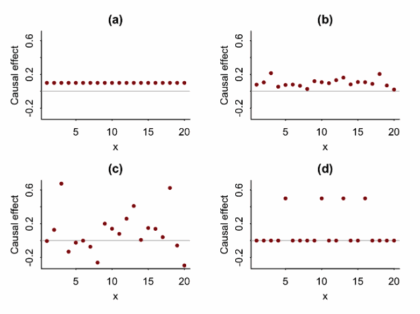
Article Title: Causal Quartets: Different Ways to Attain the Same Average Treatment Effects [DOI:10.1080/00031305.2023.2267597]Authors & Year: A. Gelman, J. Hullman, and L. Kennedy (2023)Journal: The American StatisticianReview Prepared by Peter A. Gao Causal inference research commonly focuses on estimation of average treatment effects: In a target population, what is the difference in mean outcomes between individuals who receive the treatment and individuals who receive a control? For example, imagine an experiment investigating whether limiting daily phone usage improves academic performance among high school students. Subjects are randomly sorted into a treatment group (limited to one hour of phone time daily) or a control group (unrestricted) and over the course of a semester, their academic performance is measured using exams. In this case, the average treatment effect is simply the average exam score of the treated students minus the average score of the control students. If this effect is large and…
How can Gaussian graphical Networks Models help in exploring Ovarian cancer data?
Article: Gaussian graphical models with applications to omics analysesAuthors and Year: Katherine H. Shutta, Roberta De Vito, Denise M. Scholtens, Raji Balasubramanian 2022Journal: Statistics in Medicine Review Prepared by: Sanou Edmond, Postdoc in BiostatisticsNuclear Safety and Radiation Protection Authority (ASNR) As scientists collect more detailed biological data, they use networks to understand how molecules in the body interact and how these interactions relate to disease. This type of data, known as omics, includes information about genes (genomics), proteins (proteomics), and other molecules. These networks can help find genes linked to illness and even suggest possible treatment options. Statisticians help by using tools that highlight which molecules are directly connected. In their tutorial “Gaussian Graphical Models with Applications to Omics Analyses,” Shutta et al. recommend using a method called Gaussian Graphical Models (GGMs) to study these connections. GGMs help draw simple, clear maps of how molecules relate to each other. The authors…